Widgets
I'm still working on updating all the documentation, and there are more widgets to add to the template. It takes a bit of time as I have to go through them all and make sure everything is properly sourced and then clean it up a bit before adding things into the packs.
Labeled Slider
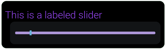
A compact label + slider widget for numeric settings (e.g., volume, brightness). Left side: text label. Right side: slider.
Widget class: CUI_LabeledSlider_KSyn
Base Class: (Common Activatable Widget)
Use for: 0–1 or bounded float values with a visible label
Navigation: Fully focusable; supports keyboard/gamepad/Mouse
Quick Use
- Drop Labeled Slider into your settings screen.
- Set is Variable
- Set Label Text and the value range (Min/Max).
- Set Step Size so left/right adjusts predictably.
- Bind On Slider Value Changed to apply your setting.
- Initilize slider position when the UI is activated, or the value changes.
Properties
-
Min Value (float)
Lowest allowed value. The result is clamped to this. -
Max Value (float)
Highest allowed value. The result is clamped to this. -
Step Size (float)
Increment used for keyboard/gamepad nudging (and snapping while dragging).
Tip: Choose a step that divides the range cleanly (e.g., 0.05 for 0–1). -
Label Style (Common Text Style asset)
Controls label font, size, color (e.g.,UI/Styles/Text/TS_Label). -
Label Width (float)
Fixed width for the label column. Use to align multiple rows. -
Label Height (float)
Fixed height if you need a uniform row height. -
Slider Style (Slate Widget Style asset:
FSliderStyle)
Controls thumb/track visuals (e.g.,UI/Styles/Slider/SWS_Default).Note: Styles are assets; swap them to re-skin without editing the widget.
Events
- On Slider Value Changed (float NewValue)
Fires continuously while dragging or nudging.
Recommended Patterns
- 0–1 settings:
Min=0.0,Max=1.0,Step=0.05(or0.01for finer control). - Percent display: Store
0–1internally - Alignment: Give all labeled sliders the same Label Width for tidy columns.
- Accessibility: Ensure label text clearly states the setting (e.g., Music Volume).
Example (Volume)
- Label: Music Volume
- Min/Max:
0.0→1.0 - Step:
0.05 - On Value Changed: Update volume
Troubleshooting
- Value “jumps” on commit: Choose a Step Size that divides the range cleanly.
- Gamepad left/right too slow/fast: Adjust Step Size.
Bound Action Button

Widget class: BoundBtn_ActionButton_KSyn
Use for: Displays available actions in the action bar.
Navigation: Clickable with mouse. As these are ussually always available actions when present in the bar, controller navigation is not ussually needed or desired.
Base Button
Widget class: Btn_ButtonBase_KSyn
Base Class: (Common Button Base)
Use for: Todo
Navigation: todo
Properties
- Style (float)
Todo - Text (float)
Todo - Height (float)
Todo - override Width (float)
Todo - Width (float)
Todo - Text Style (float)
Todo - Text Style Hovered (float)
Todo
Resolution Button
Widget class: Btn_ResolutionButton_KSyn
Base Class: (Common Button Base)
Use for: Todo
Navigation: todo
Checkbox, Text
Widget class: CUI_CheckBoxText_KSyn
Base Class: (Common Activatable Widget)
Use for: Todo
Navigation: todo
Properties
- Label Text (float)
Todo - Height (float)
Todo - Width (float)
Todo - Check Box Style (float)
Todo
Checkbox, Labled
Widget class: CUI_LabeledCheckBox_KSyn
Base Class: (Common Activatable Widget)
Use for: Todo
Navigation: todo
Properties
- Label Text (float)
Todo